
Last month we talked
about the use of color, bold and beautiful!
We touched on what kind of impact color can have on your space, the way
it makes us feel and how we function in it. But how do you pick the perfect
color palette for you? I’m going to suggest a few ways to find the perfect
palette for your abode.
First, look at your
wardrobe. Most people dress in colors they look good in and that make them feel
good. Similarly, you should decorate
your home in colors you enjoy wearing. “If
you don’t wear yellow [because it makes you look sickly], don’t get a yellow
sofa”. (Mark McCauley, author of Color Therapy at Home: Real Life Solutions for Adding Color to Your Life)
Second, take a look
at the largest pattern in your room. Whether it’s a rug, patterned upholstery
or a large piece of artwork, find a color in the pattern that you would like to
pull into the room. Likewise, if you are
wanting to paint or color a piece of furniture with a neutral color, look at
the pattern’s tones of creams, whites, beige’s or grays to pull from. You will
be able to find a color or neutral to work in the room while maintaining
cohesiveness. Whichever favorite piece
you are pulling from, this is your “spring board” or “inspiration piece”.
Once you have that
“spring board” and you are ready to look for accent colors, don’t forget about
your color wheel! Yes, color wheel! Remember that wheel you saw in art class
back in grade school? And really people, you should recognize it from last weeks blog! : ) Here is a picture to jog your memory:

Well, your trusty ole color wheel can be a good reminder of
how to create a color scheme. Colors that line up beside each other on the
color wheel, such as blue-green, green and yellow-green create an analogous
color scheme. This color wave is a more
subtle color progression that is great for creating a calming space. If you are
decorating with a rusty orange hue, you could look at accenting with blue;
orange and blue are complimentary colors.
Complimentary colors are across from each other on the color wheel and
appear brighter when these colors are used together. Conversely, a split
complementary color scheme is the grouping of a color with two hues analogous
to its complimentary. Such as:

Similarly, a triadic color scheme uses any three colors
equally spaced on the color wheel, with one color usually taking precedence. A
triadic scheme looks something like this:

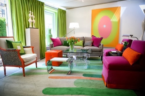
When decorating a
space, many designers suggest following a color principal referred to as the
“60-30-10” rule. By dividing your color scheme into components, where your
dominant color makes up 60 percent of the color used, 30 percent of a secondary
color and 10 percent of an accent color.
For, instance, the walls will most likely be the majority, the upholstery
would represent the secondary color and accessories such as throw pillows and
floral arrangements would make up the remaining accent colors of your color
scheme.
Finding your inspiration, then following a
few simple formulas may be all you need to get you on a path to a harmonizing
space! We always have lots of ideas and inspiration here at Creative Interiors
- come and see us!

 |
Textiles, bedding, and window treatments by Creative Interiors
References:
McCauley, Mark. Color Therapy at Home: Real Life Solutions for Adding Color to Your Life
The Color Wheel. http://www.bhg.com/decorating/color/basics/color-wheel-color-chart/
Houzz.com