Saturday, October 19, 2013

How to Hire and Work with an Interior Designer

   Most people will tell you that their home is more than just the place they lay their head.  Your home is where your family works, plays, loves, and lives! Your home is an investment. It is not just an investment because of its monetary value, but also its personal value.  Hiring an interior designer or decorator will maximize your potential to increase the value of your home, yes…but also the personal investment of improving the quality of your life in the spaces you spend your most valued time.

   Many people find themselves intimidated when hiring a professional decorator or designer. I hope you never feel that way! Your home and your design style is about YOU; therefore your designer should be about you!  There are a few tips we want to share in how to go about hiring a designer that will make your renovation or decorating process more enjoyable than you thought possible!

   With a boo coo of design challenges out there, it is no wonder we are turning to professionals. Whether you are downsizing and trying to figure out the best way to fit your furnishings from your suburban manse into your town condo, or finding your ready-made drapes dwarfing in your newly built home, or if you have been in your home since the 70’s and it looks like it…. we want to help you with that!  With the recent recession having reacquainted us with the virtues of frugality, clients are determined to spend decorating dollars wisely…. And guess what! Decorators and designers can, actually help with that too.  As designer, Mario De Armas, has put it, “it’s not about how much you spend. It’s how you present it.”

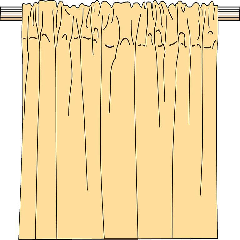
 Window treatment designed and created by Creative Interiors.
Client's furnishings original furnishing used throughout as much as possible.
Sofas' upholstery and pillows were re-worked
   The least fun aspect of hiring any service comes down to money; so, let’s go ahead and talk finances and get it out of the way!  You always want to make sure you and your designer see eye to eye financially. Spelling out fees and budgetary concerns up front will save you both headaches down the road.  There are many ways decorators and designer may structure their fees.  According to the American Society of Interior Designers, there are three primary payment structures that are the most common.  The first being, a fixed, or flat, fee for all services.  Other designers may simply charge an hourly rate.  Or they may ask for “cost plus”; in which case, they buy furnishings and services at cost (or more commonly, discounted from retail prices) and they add an agreed upon mark up. Many designers, depending on the job, may use a combination of the fee types listed. For instance, they may ask for a fixed fee during the planning phase and then cost-plus to execute.  Be sure and check with your designer or decorator to see if they require a deposit or retainer.  Also, find out who will be paying for the furnishings- do you pay upfront?  Don’t let money come between you and your designer!

  Your relationship with your designer or decorator is a special one. They get to know you and your family, and how you function in your most personal space. With that said, your designer’s personality should be compatible with yours. Make sure your designer is someone you feel comfortable around.  Likewise, you are looking to work with a professional. Do they return your calls? Do they show up on time? The stereotype of the artsy designer (fun, creative and even a little flighty) is not unfitting. Who wants a stodgy, uptight decorator anyway? However, customer service is one of the key indicators of satisfaction. So although you want your designer to be fun, make sure they are organized and professional.  Your designer should also take notes during your first few consults. They should be interviewing you as much as you are them.  Designer are problem solvers. Getting a grasp on the scope of the project and the challenges your job may present is their primary focus at the beginning. Don’t stress if they are asking you a lot of questions, it’s a good thing!

Bedding designed and fabricated by Creative Interiors.
 Client's furnishings original furnishing used throughout as much as possible.


   It is true that many designers have a signature look; however, a good designer should be able to accommodate your tastes even if his or her personal style is completely different. That said, you may be looking to grow your own personal style or discover what “your style” is. When considering interior designers and decorators, also consider how involved in the creative process you plan to be and, what kind of guidance you need.  Are you looking to collaborate with a designer on creating your perfect space, or are you looking for your designer or decorator to present complete décor options to you?  Are you open to suggestions? If you already have images of graphic designer wall paper dancing in your head, be prepared to communicate that to your designer. No matter how much knowledge or experience your designer may have, you can be sure mind reading is not a skill taught in design school. Keep in mind, your designer’s unique approach may not mesh with your needs, making communication critical in this area also.

  As with any professional, don’t be afraid to ask your prospective decorator or designer about their experience, education and for referrals.  This goes back to the idea that you are looking for a professional, not someone who decorates as a hobby.  These days you don’t have to look very far to find a designer who has been formally educated. Working with a designer means that you will have a professional that is trained and comfortable with spatial planning, and can help design and renovate interiors, right from working with the architect or builder in drawing up the initial floor plans to placing the last decorative accent. Designers are proficient in enhancing the function of a room as well as the aesthetics, making the end result beautiful and practical. Decorators are not required to have a formal education while their experience may be indubitable. Decorators generally come on board after a project is complete. They're hired to create a look that will be comfortable and inviting. When determining the scope your project, make sure your prospective designer/decorator’s credentials meet your needs. By looking at their experience as well as their education, you may find that the designer you are considering has experience in areas or lighting design or kitchen design.  Knowing you can lean on their knowledge and understanding in these areas can be a big relief in a big renovation project.


Media and Game Room, designed by Creative Interiors.

  I hope you take away from this “how to” puts your mind at ease if you are considering hiring a professional designer or decorator for your next home project. As with any working relationship, communication is key. Whether its finances or your style dreams don’t be afraid to put it out there. The bottom line is your designer is there to make the experience of designing and decorating your home fun, and to help make sure you see it all come to fruition! As put by Interior Designer, Meredith Marlow, “Choose wisely and you will not regret it! The right designer will save you time, money and a lot of frustration.” 


Monday, September 23, 2013

Choosing Your Color Palette - Formula for Success!

   Last month we talked about the use of color, bold and beautiful!  We touched on what kind of impact color can have on your space, the way it makes us feel and how we function in it. But how do you pick the perfect color palette for you? I’m going to suggest a few ways to find the perfect palette for your abode. 

   First, look at your wardrobe. Most people dress in colors they look good in and that make them feel good.  Similarly, you should decorate your home in colors you enjoy wearing.  “If you don’t wear yellow [because it makes you look sickly], don’t get a yellow sofa”. (Mark McCauley, author of Color Therapy at Home: Real Life Solutions for Adding Color to Your Life)

   Second, take a look at the largest pattern in your room. Whether it’s a rug, patterned upholstery or a large piece of artwork, find a color in the pattern that you would like to pull into the room.  Likewise, if you are wanting to paint or color a piece of furniture with a neutral color, look at the pattern’s tones of creams, whites, beige’s or grays to pull from. You will be able to find a color or neutral to work in the room while maintaining cohesiveness.  Whichever favorite piece you are pulling from, this is your “spring board” or “inspiration piece”. 

   Once you have that “spring board” and you are ready to look for accent colors, don’t forget about your color wheel! Yes, color wheel! Remember that wheel you saw in art class back in grade school? And really people, you should recognize it from last weeks blog! : ) Here is a picture to jog your memory:


Well, your trusty ole color wheel can be a good reminder of how to create a color scheme. Colors that line up beside each other on the color wheel, such as blue-green, green and yellow-green create an analogous color scheme.  This color wave is a more subtle color progression that is great for creating a calming space. If you are decorating with a rusty orange hue, you could look at accenting with blue; orange and blue are complimentary colors.  Complimentary colors are across from each other on the color wheel and appear brighter when these colors are used together. Conversely, a split complementary color scheme is the grouping of a color with two hues analogous to its complimentary.  Such as:

Courtesy sharing by: Houzz


Similarly, a triadic color scheme uses any three colors equally spaced on the color wheel, with one color usually taking precedence. A triadic scheme looks something like this:   


 By changing the tints and chroma (a color’s brightness or dullness) of your colors you can create different feels to the same color scheme until you find what fits your personal style. These tried and true color combinations can give you endless fail proof inspirations!

   When decorating a space, many designers suggest following a color principal referred to as the “60-30-10” rule. By dividing your color scheme into components, where your dominant color makes up 60 percent of the color used, 30 percent of a secondary color and 10 percent of an accent color.  For, instance, the walls will most likely be the majority, the upholstery would represent the secondary color and accessories such as throw pillows and floral arrangements would make up the remaining accent colors of your color scheme.
   Finding your inspiration, then following a few simple formulas may be all you need to get you on a path to a harmonizing space! We always have lots of ideas and inspiration here at Creative Interiors - come and see us!


Textiles, bedding, and window treatments by Creative Interiors


References: 

McCauley, Mark. Color Therapy at Home: Real Life Solutions for Adding Color to Your Life
Houzz.com


Monday, August 26, 2013

Pick Your Palette


   Deciding on colors for your home may feel daunting to some. Analyzing the use of the room, how you plan to interact in the space, and how you want to feel in the space may dramatically impact your color scheme. Color has the power to make a small room feel larger and a large room feel more intimate. Colors can play on our psyche to make us feel empowered, calm, anxious or even hungry. One way to start is by categorizing your rooms into passive spaces and active spaces. For example, " Kitchens fall into the active category, while bathrooms tend to fall into the passive group" (Trattner, HGTV.com)

  Warm colors such as reds, yellows and oranges inspire activity and are like wise designated for more active spaces, typically.  Warm tones visually move towards you in a space. When used on large surface areas such as walls, floors, or even ceilings it can have the affect of bringing a space in.  In a larger room this could naturally make a space more cozy and intimate. Conversely, in an already small space, it can make a room feel more cramped.  More vibrant hues of these warm colors can have varying affects on us as well.  Red is the most powerful color of the color wheel ,and therefore, is a good example.  Red is often described as the color of fire and passion. When used in an intense or bright hue it " has been shown to increase heart rate and blood pressure" (aokiinteriors.com) Reds have also been shown to stimulate the appetite and conversation. It is important to consider how you want to use such a powerful color as it can also make you feel that the perceived temperature of the space is elevated. More muted earthy shades such as a red ocher may make you feel quite cozy.  More earthy hues can give you all the warmth, comfort and energy  but with none of the exaggerated pulse"(aokiinteriors.com).
Robert Allen Design Studio


  Conversely, your blue, purple, and green hues embody your cool tones. These hues are better reserved for "passive" spaces. Blues and greens are noted for being calm and restful. The two colors most representative of nature and most indicative of balance and harmony.  As mentioned, reds have been known to stimulate appetite. When observing nature, you'll find many natural occurring red foods;  unlike, the color blue, where there are little to none naturally blue foods (even blueberries are a deep purple) Consequently, painting your dining room or kitchen blue may help to suppress your appetite!  
    

 Robert Allen Design Studio

  There are many theories that can be applied when considering colors. Pick flavors that inspire you and make you feel the best in the room that your outfitting! 

Wednesday, May 1, 2013

Turn your Kitchen Counter into a Touch Screen


Tuesday, April 23, 2013

Decorating With Red


Red is a great color to use when interior decorating if you’re looking to make a statement. It is bold, warm, and full of passion. Red walls can radiate a stimulating energy and is traditionally representational of love, battle, and warmth. Red is one of few colors that can convey numerous emotions. Red is also a great accent color and is often used to draw attention to certain areas of a room or to make special, exciting features pop. Reds can offset paler, washed out colors and also coordinates well with darker hues of black, navy, and grays. When mixed with warmer shades of oranges, golds, and yellows the color radiates a sense of warmth and coziness. Reds are currently most popularly used in kitchens, living areas, and home offices. These are areas where the mind is stimulated and people are active versus a calm, relaxing, or quieted space like a nursery or bedroom.


Thursday, April 11, 2013

Simplistic, Natural Window Treatments

Minimal and natural window treatments are becoming a popular trend in interior decorating as  the want for “green” design sky rockets. Whether you find yourself in need of fresh window treatments or are starting with a blank palette, it is easy to create and customize window coverings that are simple and minimalistic, while still reflecting the style, personality, and theme of your room. Exposed wood grain in blinds and natural woven shades are surfacing with bamboo as popular choices for modern, simplistic window coverings. Wood is making a comeback in decorative hardware, while bamboo, birch and maple are the materials of choice for the newest finials and pulls. The natural woods are light, in color and can be easily incorporated into various styles of décor. Another trending, modern window treatment is natural woven shades in bamboo and matchstick. These woven shades come in different colors of wood, and some include grassy woven accents. These treatments allow into the space but still allow for privacy. 

United Supply Company, sold at Creative Interiors.

Wednesday, April 3, 2013

Fabric Canvas DIY project!


Looking for an inexpensive yet crafty way to spruce up a drab room in your home? Try this easy, do-it-yourself project for a few new decorative wall pieces! Start by finding a fabric that you love; maybe something that coordinates with your wall color or pillows. (Robert Allen and P. Kaufmann are two textile companies that have trendy and interesting fabrics each season!) Make sure you purchase enough fabric to cover the entire canvas. Then all you’ll need to get started is staple gun, scissors, and a canvas, all of which can be bought at most craft stores. Find the composition that you want to show within the fabric and smooth out the cloth. You may have to iron it, depending on the type of fabric, but stretching it tightly on the frame will remove many of the minor wrinkles. Then all you have to do is staple it to the canvas frame! Start by placing a staple in the center of each side of the frame. Work out toward the corners, adding only a few staples to each side before moving to the next. The corners can be neatly folded and stapled to the backside of the frame. Viola! A there you have it! A simple, inexpensive and quick way to display some of your favorite textile prints and liven up a drab room!


Thursday, March 28, 2013

THIS is an entrance!


The entrance is the first impression of the entire house. It sets the stage for all to see. This is where you should remember the key term that all house savvy people know: BONES. The bones of the house are the things you don't pack up and take with you when you move. The floors, moldings, the wood work, etc. This is what you should put your big bucks into, because good bones means a good listing price! For a grand entrance like this, one with magnificent bones, always call a skilled professional, like a builder. Builders work with designers all the time to make the most perfect house come alive. In fact, some are both builders and designers!


designbuildersonline.com
Posted by Picasa

Friday, March 22, 2013

Bold Prints: Houndstooth

Houndstooth has gradually made its way from the fashion industry into home décor. Always the attention getter, houndstooth is a classic pattern that easily adapts to various seasons and can enhance everything from vintage to modern-looking spaces. Houndstooth is traditionally recognized in its bold black months and white palette during the fall and winter, but can now be found in an array of colors to coordinate and be stylized with all interior schemes. Depending on the scale, a houndstooth pattern can be very muted and quiet or bold and demanding. Small houndstooth prints are soft and charming, often relaying a vintage feel to accent pillows and blankets. Larger prints found on draperies or upholstery are more graphic, lively, and attention getting. The print can quickly add stylish and sophisticated flair to a bedroom. Accentuate your bedding with a houndstooth comforter, bedspread, or quilt for a classic look. Choose a traditional black and white pattern or pick bolder colors like red or yellow with white for an energetic, unconventional look. Coordinate with solid colored decorative pillows and throw blankets. Also, by placing black and white houndstooth cushions on antique chairs or vanity seats within the room, a classy, retro look can be achieved.


Sunday, March 17, 2013

Rod Pockets

Rod pocket drapes and valances are also among the most popular styles of drapery headings. Simple to explain, the rod pocket is just that- a fabric pocket sewn against the top back of the drapery where a decorative rod can be placed through. Rod pockets are popular in minimalist décor and are a less extravagant type of window treatment. Rod pockets can be used decoratively though, pulled to the side with tie backs or used as a valance, where drapery is operational. Rod pocket draperies can easily pulled for privacy and are simple to install. These draperies are simplistic and require minimal upkeep. Rod pocket draperies are easy to maintain and launder, as they can be quickly taken off the rod to hand wash or thrown in a machine. Often rod pockets are used for draperies covering doors and are managed with a tieback or by pulling the middle section together to create an “hourglass” effect. They also look nicely when they cover only half the window to create a “café curtain”.


Picture from backyardcity.com

Wednesday, March 6, 2013

2013 Home Decor Color Trends

With March quickly coming and going, most of us are starting to feel it-- the winter blues. Yes, the tease of the sunny day where it is over 60 degrees followed by the rainy/snowy 20 degree day, it makes you want to pull out your hair... but please don't do that. I have a solution!

I have been researching the upcoming SPRING color trends, and they are fabulous. Earth tones are back again, with soft blues, grassy greens, wheat yellow, and pastels that make you want to hunt Easter eggs all season long! They are used on furniture, walls, draperies, pillows, and bedding too!


Wednesday, February 27, 2013

Refurbished Mantel Headboards


At Creative Interiors we are true believers that a simple, chic, or extravagant headboard can make any bedroom truly exquisite and unique. Below are some great refurbished, antique mantels and fireplaces that have been made into artistic and luxurious headboards! Take a look...

With fabric and a new paint job, this chipped, worn out mantel became a beautiful new piece of bedroom furniture! An antique finish can give these newly refurbished mantel headboards a sense of history and coziness, often relaying a feel of shabby, yet chic, simplicity around the bedroom.


Wednesday, February 20, 2013

Brush Fringe!


There are tons of ways to use upholstery trim. One of the most important things to consider when selecting a trim is that you want it to accent the piece of furniture, rather than overwhelm it. Brush fringe is a very common type of decorative trim. According to Brandt’s Inc. a brush fringe is a cut fringe that has a flat skirt made of thin yarns. The heading of a brush fringe can vary from plain to an elaborate gimp. Brush fringe is made of very narrow hanging threads, usually made of cotton, polyester, or rayon. The fringe hangs very thick and is usually used sparingly around pillows and smaller accent pieces. Brush fringe is available in many colors and is sometimes made up of two or more coordinating colors. Creative Interiors offers a wide variety of brush trims for customers to choose from when wanting to spruce up or accent an upholstery or decorative piece in their home or office.


Tuesday, February 12, 2013

Contemporary Decorating


Contemporary decorating is intended to create uncluttered, comfortable and spacious living areas through a minimalist approach. Contemporary décor is often noted by light-filled spaces with slick finishes, open floor plans, geometric shapes, and minimal furnishings. Organic materials that are used as accents include metals, glass, and stone. Contemporary furnishings boast clean-lined chairs and tables, tailored upholstery and slipcovers, and accents of intriguing shapes. Furniture should be comfortable but not bulky. Slim window treatments are designed for a space to blend rather than to contrast with wall colors. Choices for drapery materials include silks, rayon blends, velvets, and wool, which can warm the sleek line of contemporary furniture. Upholstery is often done in leather and suede. Clean, uncluttered surfaces enhance contemporary styling. Traditional contemporary decorating focuses on neutral whites, creams, taupes, browns, and blacks; bold colors can create detailing and add excitement to contemporary décor. Splashes of bold, bright hues can accentuate specific features and add personality to a contemporary-styled space.


Picures from: Renovation Chronicles

Wednesday, February 6, 2013

Country Decorating


Country decor inspired a livable approach to interior decorating with its resurgence in the late 1970's, as items with a rustic and handmade appeal became popular in homes. Country decor features warm colors, antiques, well-crafted furniture, and handmade accent pieces. Furniture often has an antique finish, and is sometimes re-covered after being found from consignment and antique shops. Colors used to evoke this style include buttermilk creams, apple barn reds, warm yellows, deep greens, and rust-toned oranges. Hints of dark blues, straw colors, and soft grays are used as compliments. Simple window treatments, such as roman shades, valances, and half curtains allow for sunlight to illuminate an inviting space. Textile prints in country decorating include various rich-colored doilies  checks, stripes, and plaids. Natural fabrics, like cotton, linen, and wool, accentuate windows, pillows, and upholstery. Country decorating is intended to create a rustic, yet comfortable, and relaxed spirit for interiors.

bedroom cow poster in dining room
*Pictures from www.countryliving.com

Thursday, January 31, 2013

Bold Color!


One of the simplest ways to renovate and transform an interior space is with the use of color. Bold styles and flashy prints easily express personality and creativity. Good design is about combining successful compositions, making them visually attractive. When using color, you are looking to create this aesthetically pleasing palette through a combination of bold colors, furnishings, and accessories that accentuate the "feel" that you desire to have throughout the space. Bold wall colors make strong statements and can reflect dynamic personalities. Color can be used to highlight a feature wall or to incorporate trendy hues and prints in textiles. BE BOLD, use color!


Thursday, January 24, 2013

Let's talk headboards.

A custom upholstered headboard is so eye catching it is involuntarily the focal point of your room. Let’s face it; your bedroom is where you spend a great deal of your time. It’s a room that you want to make yours; make it feel personalized to your desires. Unlike a traditional headboard, a custom upholstered headboard is very comfortable, soft to the touch, and can be made just how you like. Choosing the right headboard creates a finished look for your bedroom that may remain for many years to come or, at the very least, until you are ready to remodel your entire bedroom.


Thursday, January 17, 2013

PICK ME!!

Deciding on a type of window treatment can be frustrating and discouraging at times. When making your decision, consider its importance or purpose. Is this treatment strictly for appearance? Does it need to filter out sunlight or is it for privacy? Is it being used to introduce color? Answering these questions will eliminate the wide selection of treatments you had to choose from in the beginning. Of course, you could answer yes to more than one of these. If you want to filter out light while adding color, panels or a roman shade with a bold fabric would be a choice for you. If you want something a little simpler, a valance or cornice can be added to help give your room a warm, welcoming and appealing look.


Wednesday, January 9, 2013

What about Trim & Fringe??


Trim and fringe tend to be neglected when decorating a room. Don’t let this happen! Choosing the perfect fringe to add to your curtains or pillows could be just what you needed to pull all the colors in your room together. Add an elegant fringe and achieve your goal of a luxurious look for your dining room. On the contrary, picking a less dramatic fringe to coordinate with a bold pattern can help tone it down. Trim and fringe is a subtle way to tie it all together, and carry color from room to room.

featured trim          

Thursday, January 3, 2013

"Weight" for me


When choosing a fabric for your room, consider weight; it will have a great impact on your decision. Lightweight fabrics, such as sheers, are rather delicate and wouldn't be recommended in a room where there would be a lot of “wear and tear.” This type of fabric will give a softer, airy ambiance to your room. Medium-weight fabrics are ideal to work with. They are strong enough to withstand tension, but light enough to gather or drape. This weight of fabric is very versatile and can be used for slip covers, bed spreads, panels, or table cloths; making your decorating dreams almost effortless. Heavyweight fabrics are perfect when creating an ostentatious room. They can be used as drapes or upholstery depending on your preference. Heavyweights are rich and lush fabrics that will give your room the luxuriant touch it needs.

The first photo is an example of heavyweight curtains, following with medium weight and lastly light weight.

featured window treatmentfeatured window treatment
featured window treatment