

Thursday, December 29, 2011
Soft Prints: Seersucker
Seersucker fabric is easy to find, stylish, and timeless. This easy-care, casual fabric makes an excellent choice for kids' bedrooms, guest rooms, and bath accents. Seersucker is a comfortable, light-weight summer fabric. Seersucker is cool and breathable and usually made of 100% cotton. Seersucker is generally striped, but sometimes available in solid colors. The fabric has smooth and rough surface stripes, which gives it a casual, puckered, wrinkled appearance. In this way, decorating with seersucker is similar to decorating with linen. When used in interiors it is often found in informal bedrooms and nicely accents nautical and cottage inspired décor. 
Soft Prints: Gingham Check

Wednesday, December 7, 2011
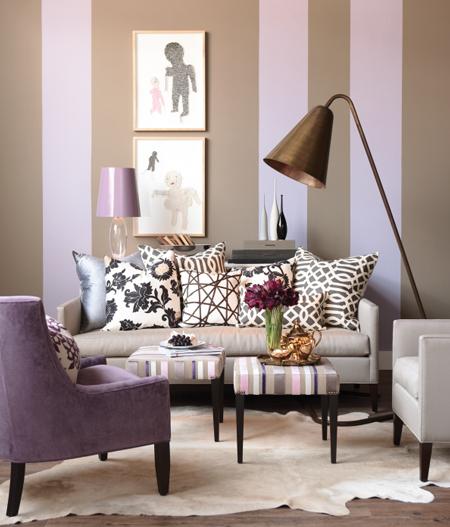
Bold Prints: Stripes
One of the oldest, most traditional of all fabric prints, stripes come in innumerable sizes, colors, and fabrics. Stripes can be chic, yet subtle and relaxing. Stripes promote order, as the vertical and horizontal lines have a tendency to direct the eye, implying indirect visual pathways. Striped fabrics are low risk when used in interiors and are easy to incorporate into existing décor. Use high-contrast stripes in unexpected spots to create interest. In spaces where people don’t linger like foyers or small powder rooms, strong stripes can be charming. Match the size of the stripes to the size of the room. In general, the larger the space, the wider wall stripes can be or larger the print on pillows or blankets. Thin, smaller stripes in a big space can be drowned out by other prints or muted, rather than pop. Likewise, in a small room broad, bold stripes can be overbearing. Blend striped, floral, and solid accessories. For throw pillows join three or four designs that are individually, clearly distinct but share a like color palette. Try a wide stripe, a narrow stripe, a dainty paisley, and a solid. The effect is cohesive while still providing variety.


Bold Prints: Animal
Looking for an edgy way to spice up a room? Let your imagination run wild with exotic animal print motifs. Current design trends mix bold animal prints that are earthy, masculine, and timeless and combine them with soft, colors and lush fabrics. Many people love animal prints, including cheetah, leopard, zebra, and tiger prints. Animal prints have become increasingly popular and more readily available for interiors. The main decorating disaster pertaining to animal print is over use. The best way to use animal print is to keep it minimal. Limit your choice to one type of animal print and use it sparingly on items in your room. Small accents such as pillows, rugs, or ottomans are great ways to add a striking bit of interest without bombarding the space.


Monday, December 5, 2011
Bold Prints: Damask


Thursday, December 1, 2011
Do's & Dont's of Floral Fabrics
When decorating with floral fabrics use different sizes and patterns. A good rule of thumb is to use at least one large pattern, one medium pattern, and one small. Mixing the size scales provide contrast and balance. Pattern repetition is always a good idea and does create unity when decorating, but don't overdo it. If you've got floral curtains you probably don't need to repeat the same fabric on any other large piece within the room, such as a couch or bed spread because the curtains take up so much visual space and the print may dominate the room if overused. Always be bold. Floral patterns are best when they're strong. Don’t be afraid to incorporate large patterns and strong colors, they look great. And remember: a lot of small patterns can often look busy and cluttered. Use a variety of different types of fabric with different textures. Mix silks and cottons and keep a coordinating fabric palette; one that uses the same colors or motifs.

Coordinating Prints
Do you love the look of coordinated prints and patterns in interior decor? Coordinating fabrics used in homes, bedrooms, and living rooms create unity within a space. Prints that mesh well together have similar patterns or motifs and incorporate similar colors, textures, and have a similar hand. You can get a more professional or high-end look when pairing coordinating prints by keeping the background colors the same with comparable patterns. Look for like colors and repeats in each fabric pattern that you choose. Keep your fabric coordinate pairings balanced by including a mixture of large, medium, and small pattern sizes or add plain or textured fabrics for more interest.


Subscribe to:
Posts (Atom)